Creating Creatin' Contest Entry Photos
Posted by Fran Casselman on 23rd Oct 2017
Contest entries have started to come in – the earliest arrived in July! – so this blog post is long overdue. The photography portion of the contest is a real challenge to many entrants, but please remember that it is part of the contest. No matter how beautiful your miniature creation is, it will be judged by the four photos you submit, so they have to tell the story you would share if we could see your actual creation.
Also, those photos really shouldn’t be telling us about your dining room curtains or that you’re in the process of choosing a new paint color for the living room. Those are distractions when you want your work to be the star.
I’m not going to tell you it’s easy, but I am going to tell you how we do it here for catalog covers and the like. Yes, we do have a small studio with neutral backgrounds and good lighting – and it’s great for small things such as item photos and small vignettes. But when miniatures get bigger, we do what you should try: We take it outside.
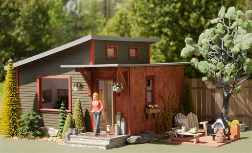
Remember our summer catalog cover? Here’s a slightly bigger version of the shot:

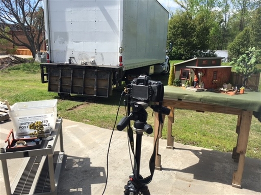
And here’s what you didn’t see (that’s our warehouse in the background on the left):

Yep, we had to wait for a dry, sunny day last spring, when there was enough “green” around to look like summer, and schlep everything outdoors. Once we found a spot with a good background and set it all up, we had to deal with a gentle breeze strong enough to knock down trees, wait for the sun to reach the perfect angle, and take a multitude of shots from which to choose “the one.” “We” is our photographer, Stephen Pennisi, and me, in the dual role of miniaturist and photographer’s assistant that day, holding a foam core board to help reflect the sun and reduce unwanted shadows.
So my point is, even the “pros” face challenges in getting the perfect shot, and everybody can use a helping hand. It’s fine for you to get help with photography and most of us probably need it, even if only to ask others what they think about a photo and learn how to make it better. Outdoors is where you’ll find the best light but, as you see, the “perfect” locale only has to look perfect in the final photo. It doesn’t have to be a pristine spot as long as you can crop out the distracting clutter and just focus on what matters.
If you have to shoot indoors, make good lighting your first priority. Try to take photos in the daytime, in a room that gets daylight from two sides if possible. Add bright artificial light if you have to, but use it to help show something that may be in shadow or not seen well with natural light. Let the light shine on your structure; don’t put it in front of the window so you’re shooting toward the light. Shoot from the same direction the light is falling if you can avoid adding shadows, otherwise shoot from the side.
The second priority is a clean background. Tape together sheets of foam core or poster board (both available at Dollar Tree) to conceal the real world, or hang a plain white sheet. Some past entrants have painted appropriate background scenes or used photos as backdrops.
Digital photo manipulation can usually be detected and is distracting. Cropping is allowed and encouraged, but do not be tempted to group multiple photos as one image and send more photos that way. Only four individual images will be judged.
Take many, many photos; weed through to find the best shots and ask someone else to look and tell you what they see. We will probably see the same thing, so keep at it until you’re showing off your best!


